What we did
- Defined the vision for the next generation of AGIʼs digital news platform.
- End‑to‑end redesign of AGI.it across information architecture, UX, and UI.
- Mobile‑first, fully responsive front‑end implementation.
- New content presentation models for breaking news, live coverage, in‑depth stories, and multimedia.
- Visual and interaction design aligned with AGIʼs refreshed brand identity.
OUTCOMES
OVERVIEW
The redesign of AGI.it marks a step change in how Agenzia Giornalistica Italia presents, distributes, and amplifies its journalism online. The previous site struggled with legacy layouts, limited responsiveness, and a structure that made it hard to surface the breadth of AGIʼs coverage—from breaking alerts to deep analysis.
The new AGI.it was conceived as a digital front page that is as fast and accessible as modern news consumption demands, while preserving AGIʼs core strengths: trustworthiness, accuracy, and editorial depth. The goal was to create a news experience that feels contemporary and effortless without sacrificing rigor or credibility.
3 BIG TAKEAWAYS

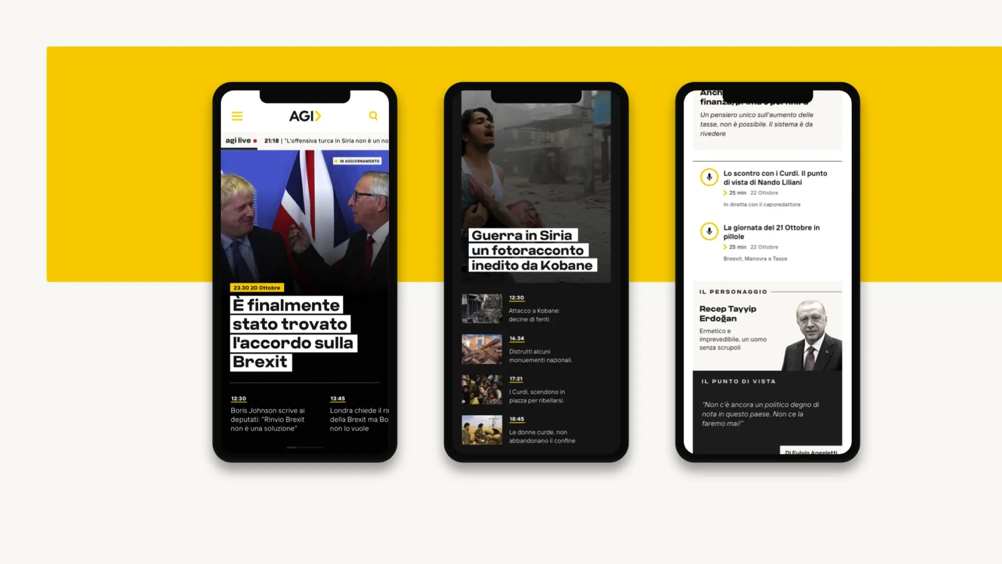
Built for a mobile‑first news cycle
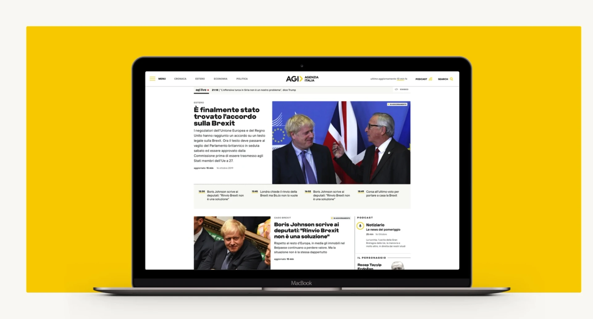
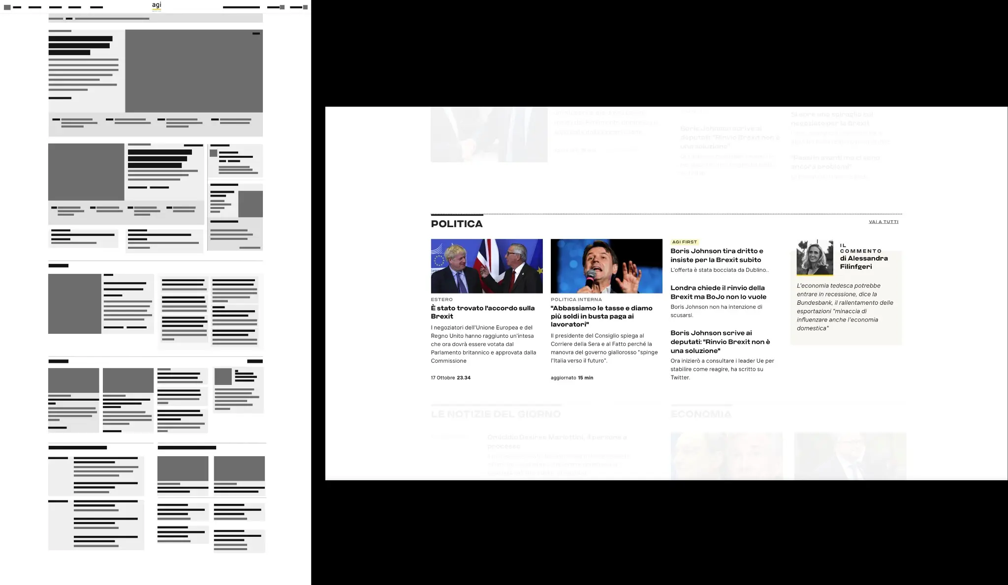
The new AGI.it is designed mobile‑first, ensuring that content is legible, scannable, and interactive on smartphones before scaling up to larger screens. Layouts, typography, image ratios, and interaction patterns were all optimized around thumb‑friendly navigation and short attention windows on the go.
A clear content hierarchy prioritizes what matters most in real time: live feeds, breaking headlines, and key story clusters are always within easy reach, so users can understand “whatʼs happening now” in just a few seconds, then dive deeper if they choose.

A richer canvas for storytelling
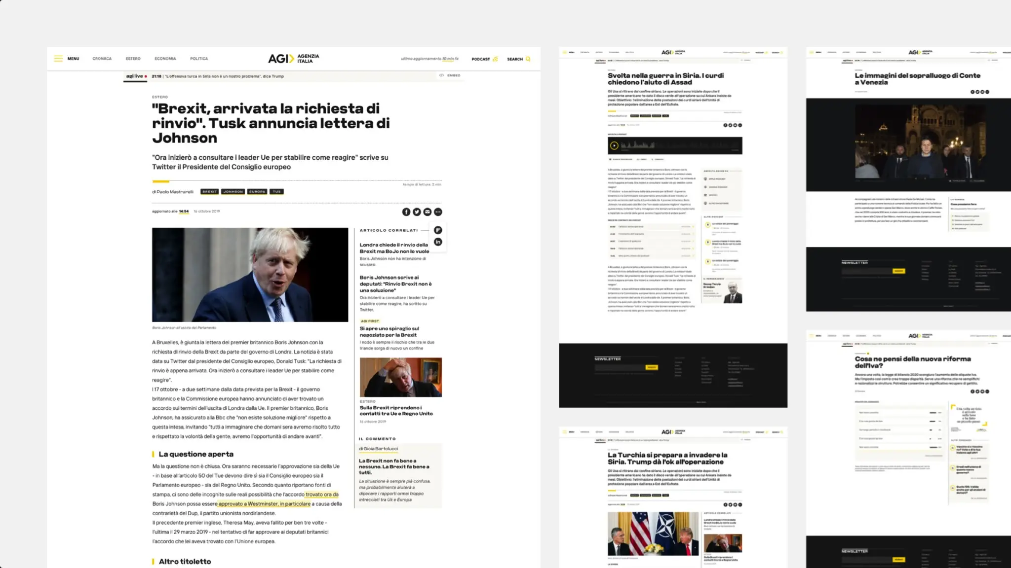
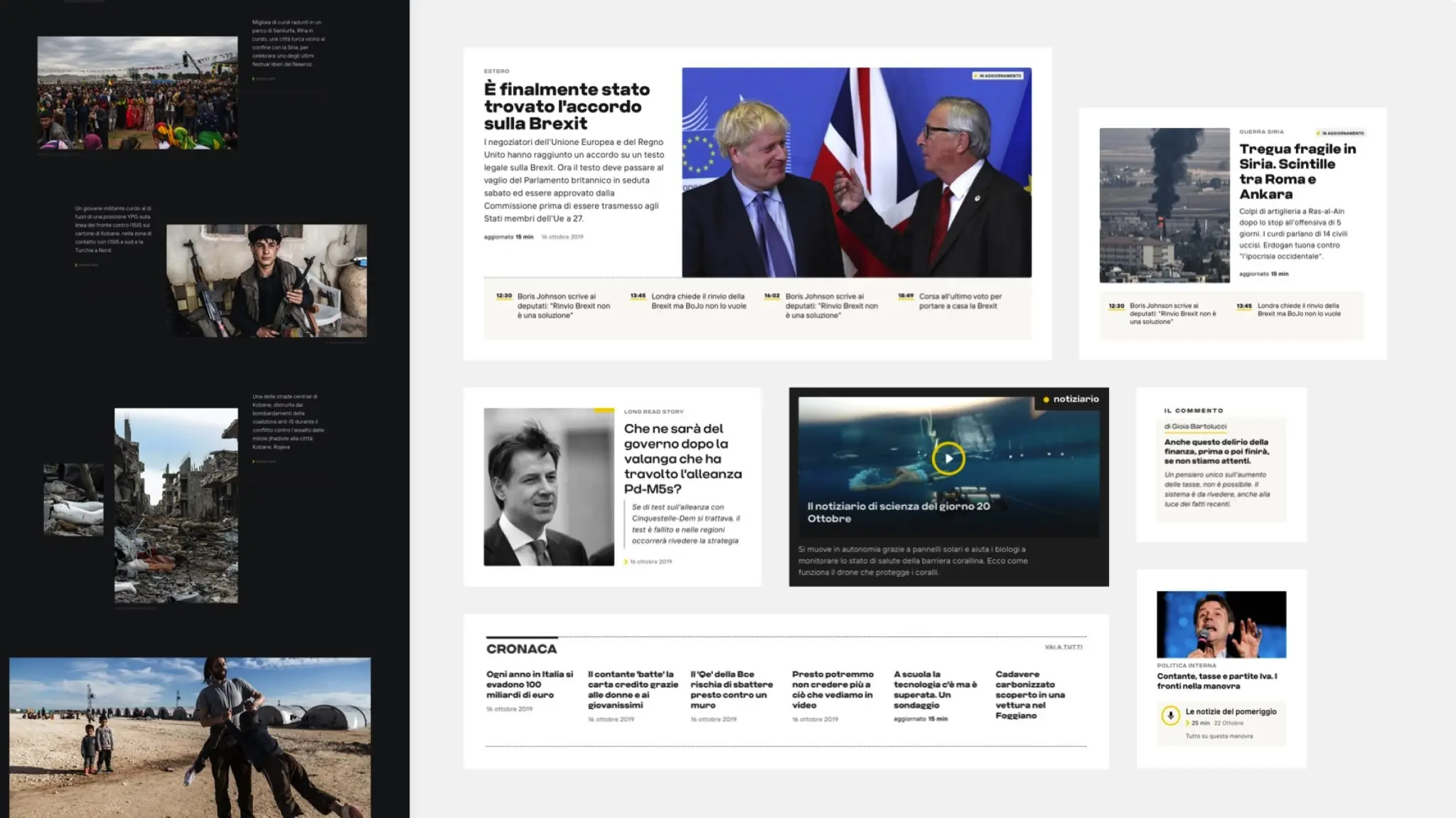
Rather than treating articles as static pages, the new platform introduces flexible templates for different story types: live updates, explainers, data‑driven pieces, long‑form features, and more. These templates support multimedia elements such as video, infographics, and interactive photo galleries to make coverage more vivid and engaging.
Home and section pages have been rethought to highlight thematic packages, related content, and context modules, helping users move from a single headline to a broader understanding of an issue in just a few clicks.

A visual system true to the brand
Visually, AGI.it embraces a clean, minimalist aesthetic that puts journalism at the center. Generous white space, disciplined use of color, and careful typography choices enhance readability and reduce cognitive load during long reading sessions.
The refreshed AGI identity is reflected in subtle but consistent ways: from the treatment of headlines and bylines to the use of brand colors in section tags, live indicators, and call‑to‑action elements. The result is a digital presence that feels both unmistakably AGI and unmistakably modern.
THE NEW EXPERIENCE IN ACTION
From chaotic feeds to clear journeys
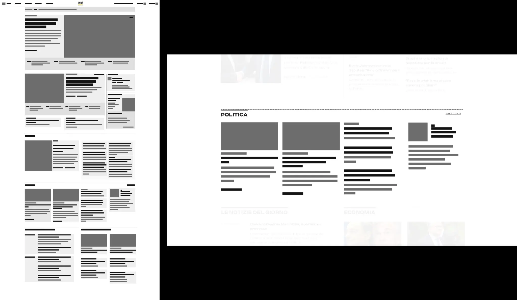
Information architecture and navigation were rebuilt around user mental models:
A streamlined top‑level navigation organizes content by key editorial domains (e.g., politics, economy, world, culture, technology).
Within each section, a predictable structure—top stories, live or latest, in‑depth pieces, and opinion—helps users quickly understand where to go depending on their intent.
Search, tags, and related‑story modules further support discovery, ensuring that a user arriving from social or search does not stop at a single article but naturally finds more of what is relevant.
Designed for editors as well as readers
Behind the scenes, the redesign also simplifies the work of AGIʼs newsroom. Flexible, modular page components make it easier and faster for editors to build rich layouts without needing bespoke design for every special topic.
This not only reduces operational overhead but also enables the newsroom to experiment with new formats—special live pages, explainers, topic hubs— without breaking consistency or slowing down production.
If you tell how you want to use this (website portfolio, pitch deck, award submission, etc.), a shorter or more focused variant (e.g., more on UX, more on brand, more on newsroom impact) can be produced from this base.