What we did
- Defined a future‐proof brand strategy and architecture for AGI and its product ecosystem (including Agi Prima).
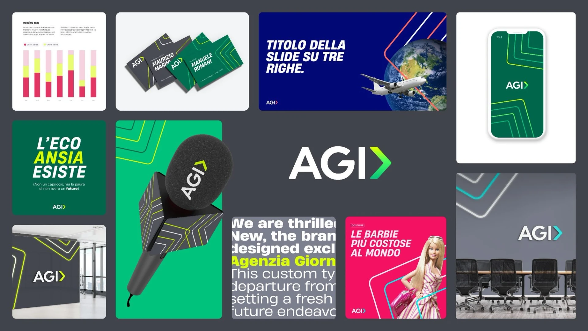
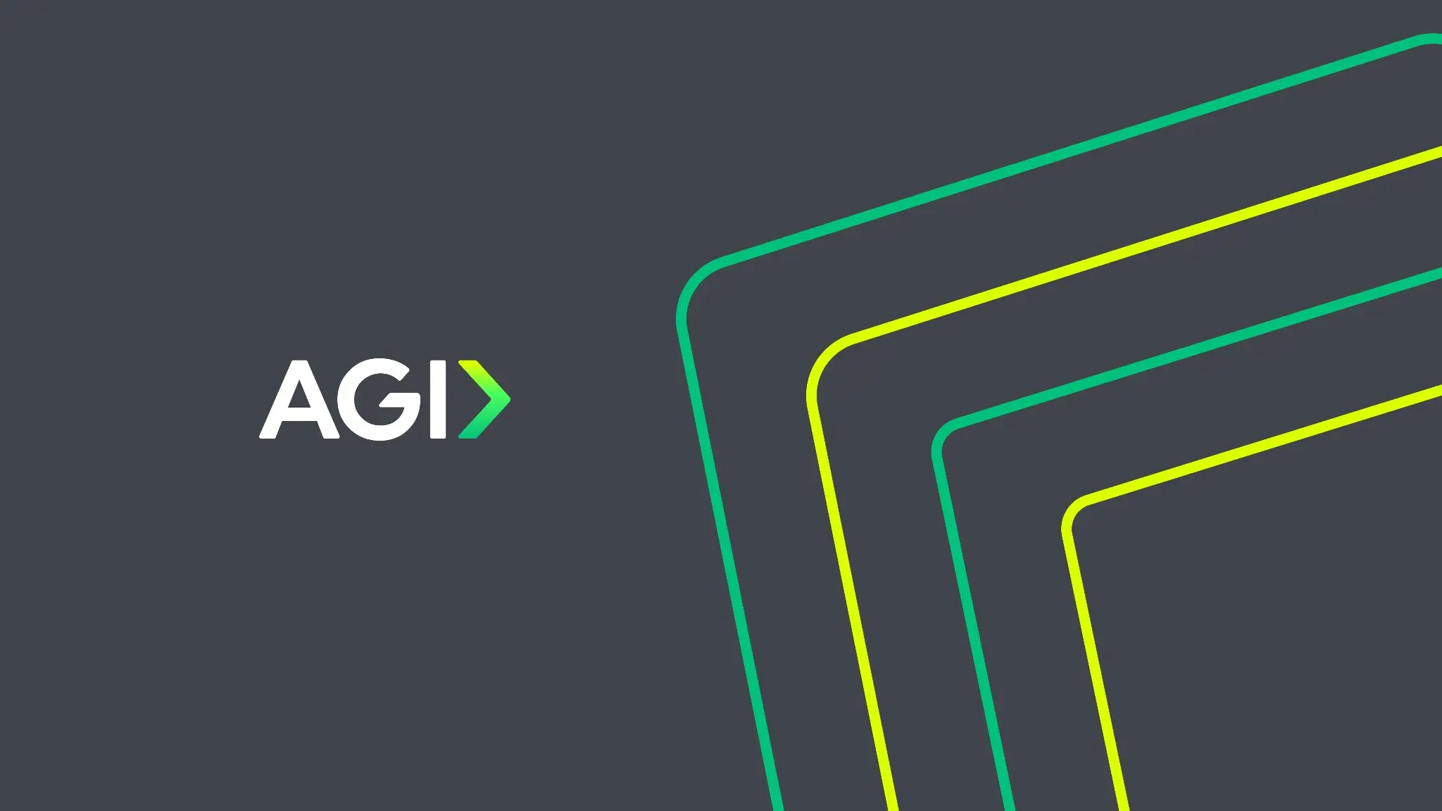
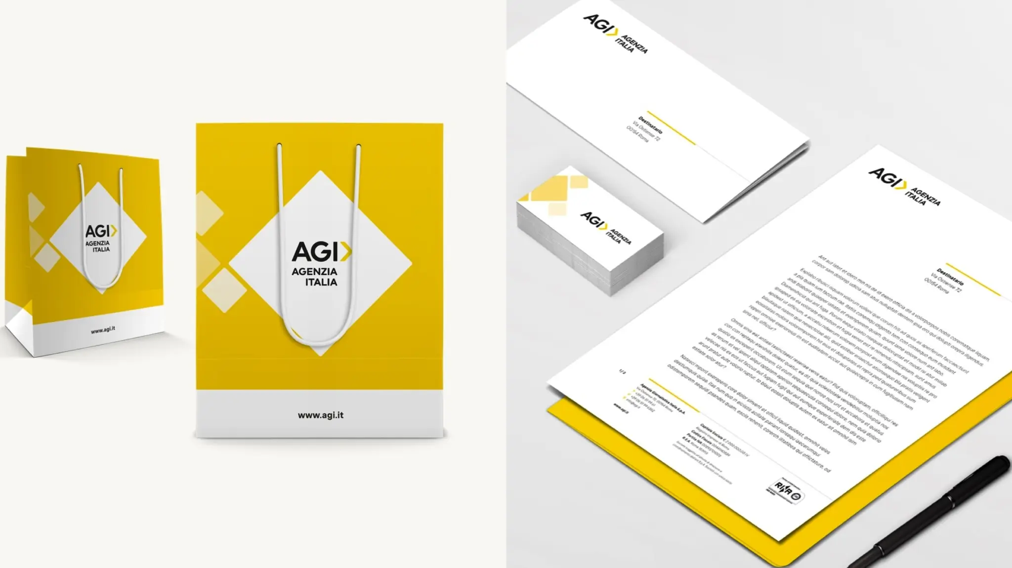
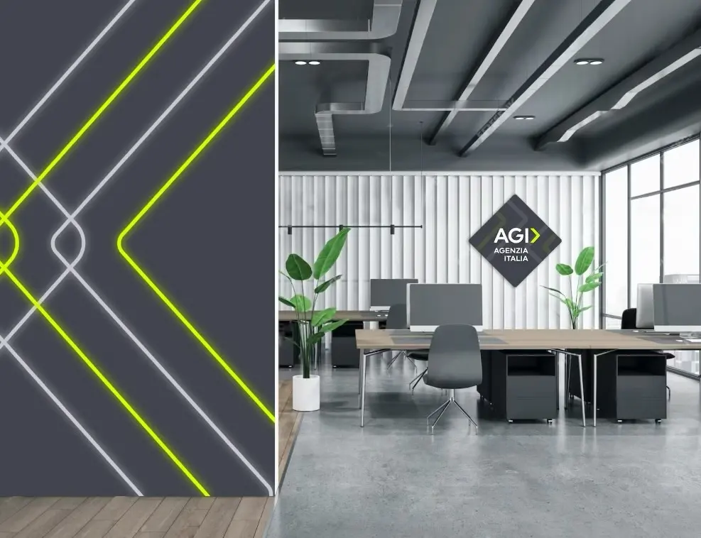
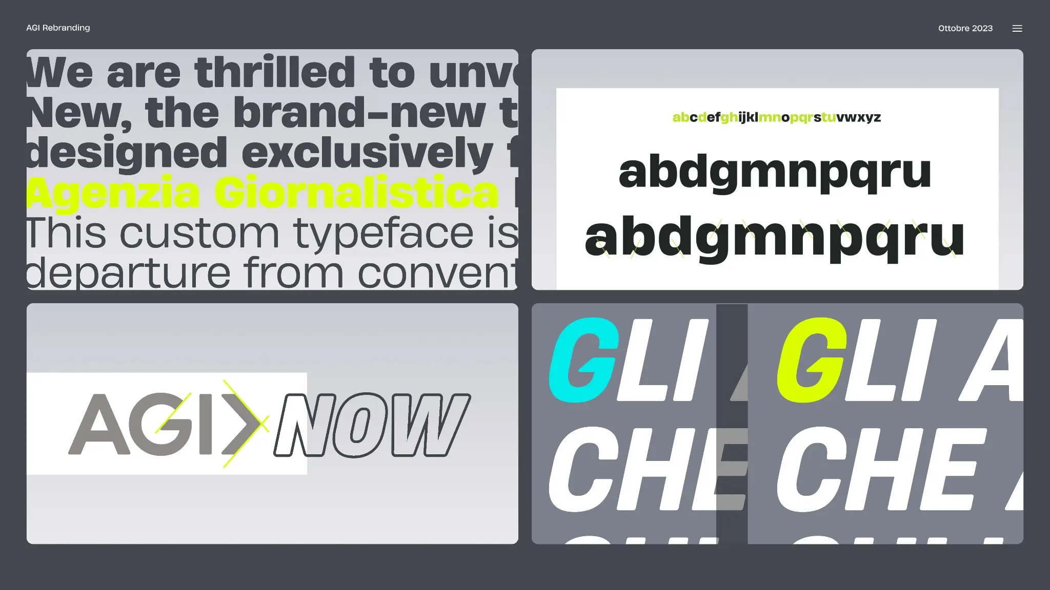
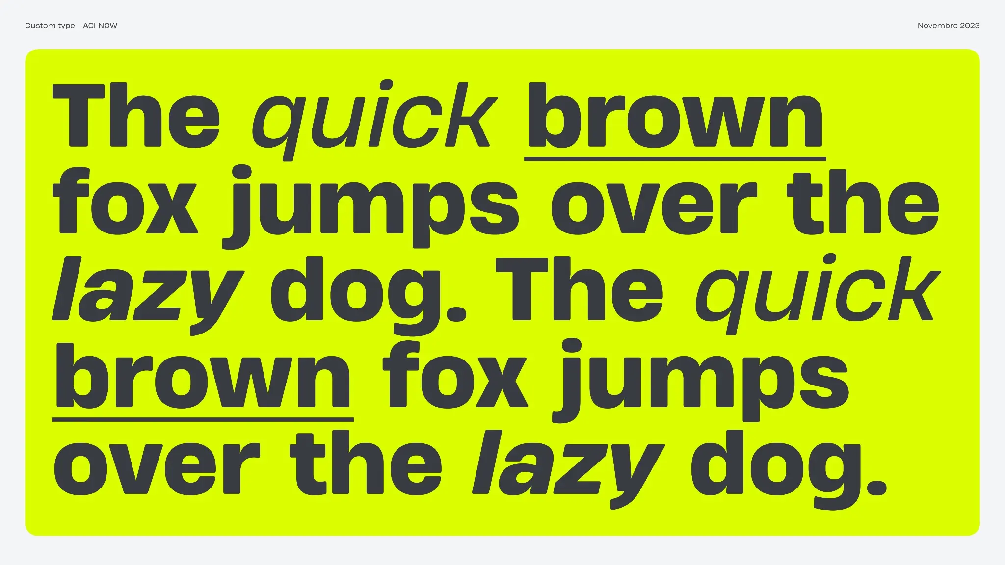
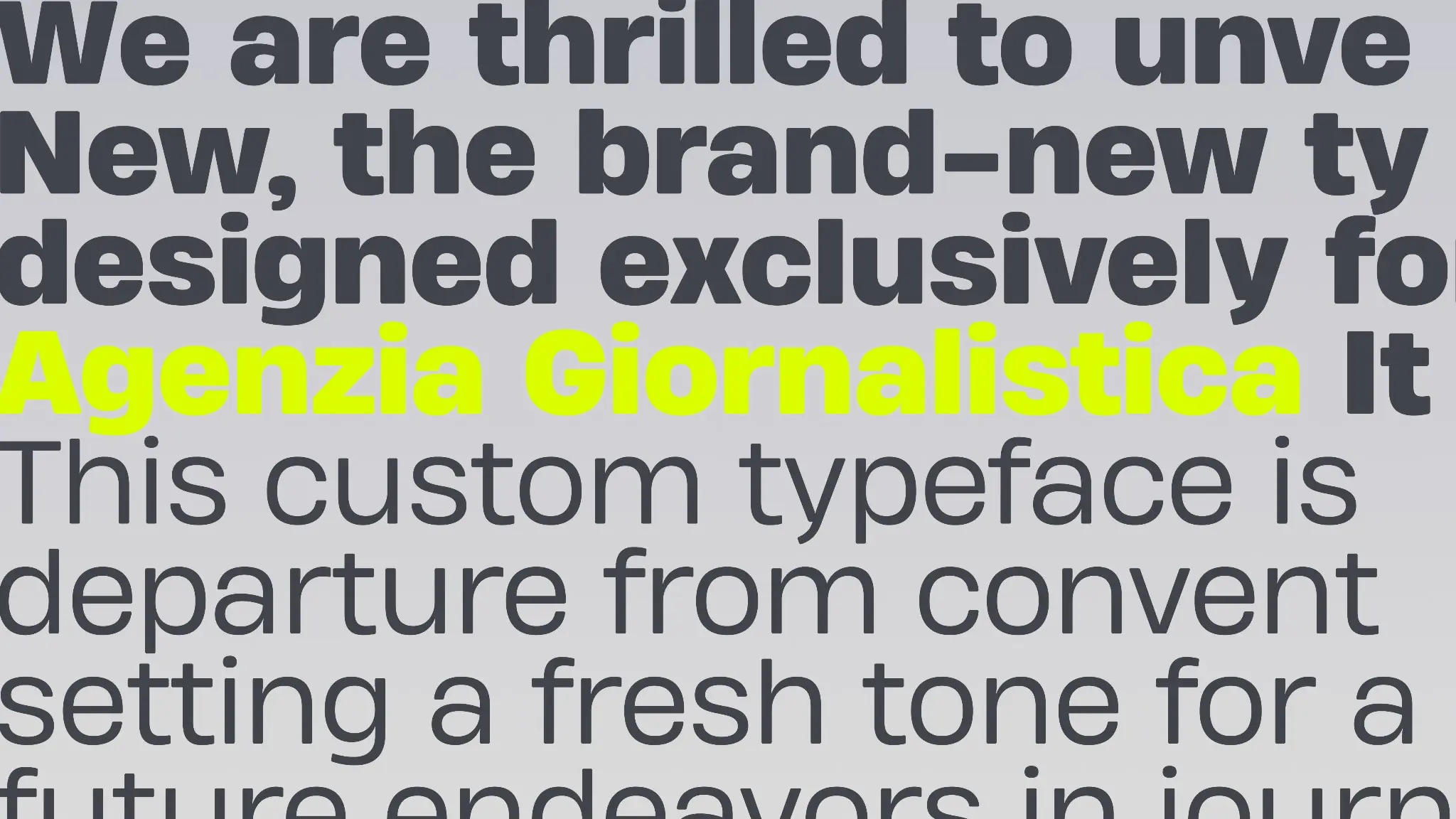
- Redefined the visual identity: logo, typography, color system, and core design principles.
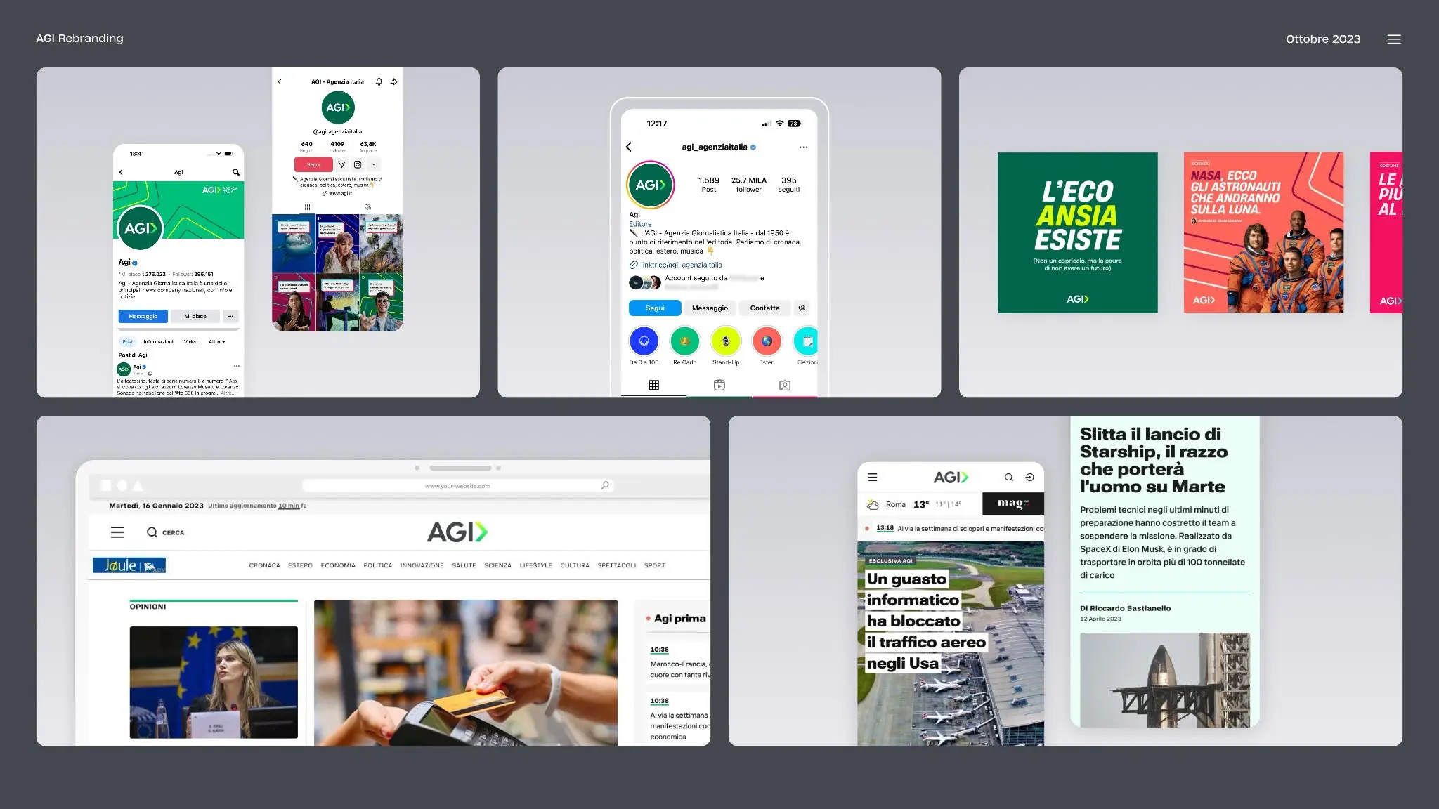
- Created a coherent, flexible design language for all touchpoints, from corporate communications to digital products.
- Established guidelines to align editorial, product, and commercial offerings under one unified brand.
OUTCOMES
OVERVIEW
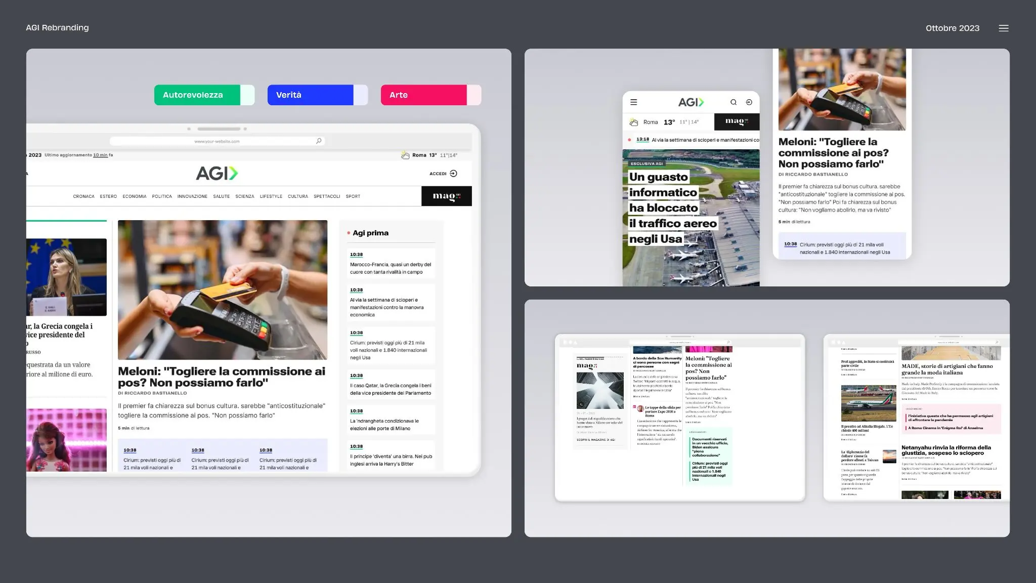
AGIʼs rebrand comes at a pivotal moment, as the organization expands from a traditional wire service into a broader media and information platform with products like Agi Prima. The previous identity no longer reflected the scale of its ambitions or the sophistication of its digital products.
The goal of the redesign was threefold: modernize the brandʼs visual language, create a coherent architecture for all products and services, and express a clear promise—combining the reliability of traditional journalism with the agility and innovation of digital‑first media.
3 BIG TAKEAWAYS

A stronger, more flexible brand identity
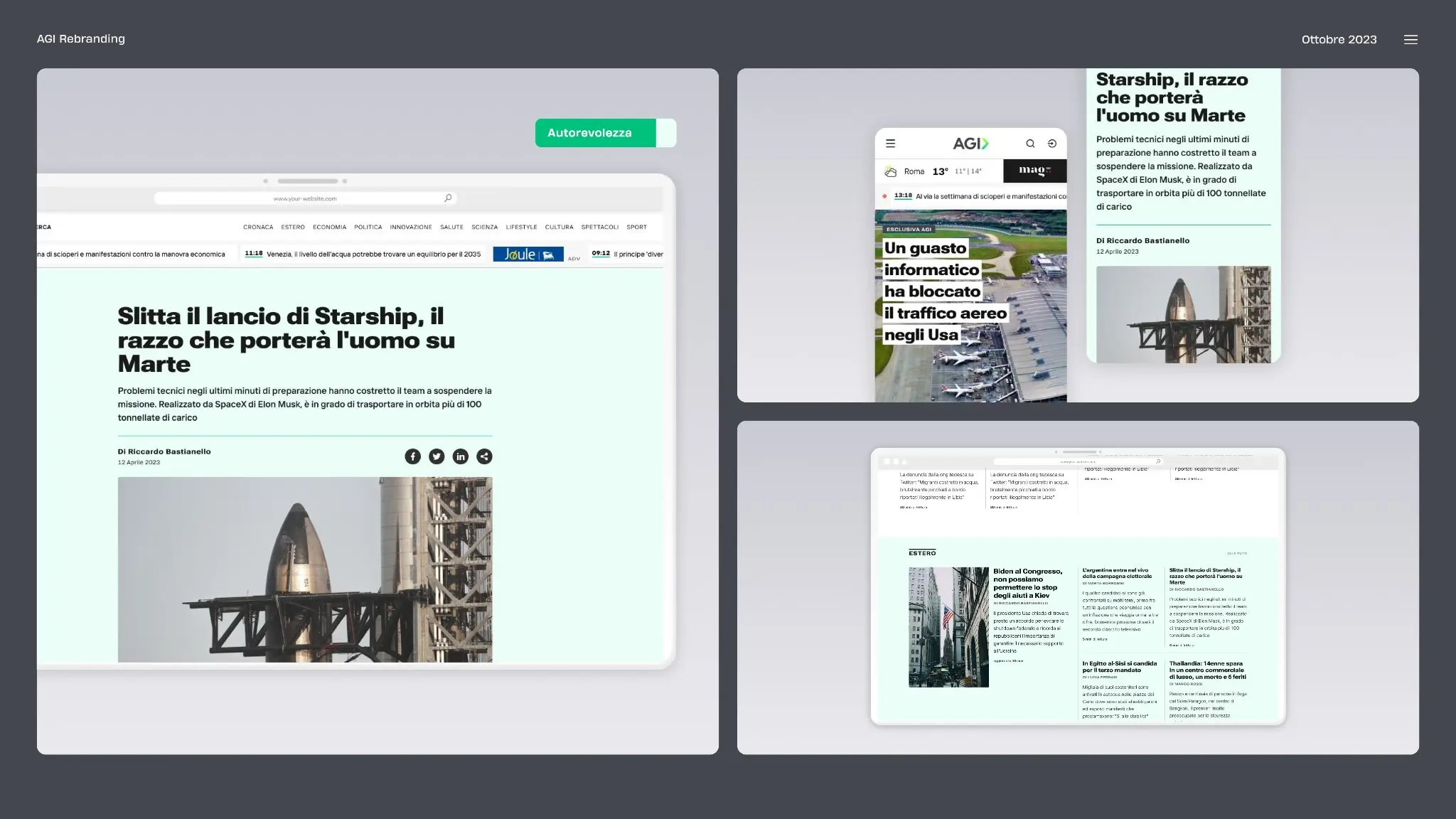
The new AGI identity preserves the agencyʼs authority and credibility while introducing a modern, dynamic look designed for digital environments. A streamlined logo, contemporary typography, and a refined color palette create a cleaner and more confident presence across all channels. The visual system is intentionally minimalist and clarity‑driven: typography, spacing, and color are used to improve readability and accessibility, whether content appears on a news terminal, a website, or an advanced data product.

Brand architecture for a growing ecosystem
AGIʼs expanding product portfolio required more than a logo refresh; it needed a clear brand architecture. The new system positions AGI as a masterbrand, with sub‑brands like Agi Prima and other digital services consistently connected yet clearly differentiated.
This approach makes it easier for clients and users to understand how each product fits into the broader ecosystem: what is “core news,” what is analysis, what is tools and platforms, and how they all share the same underlying values of speed, reliability, and depth.

A visual language aligned with the future
The new design language moves away from dated stylistic elements and legacy constraints, replacing them with a sophisticated but simple visual system that scales across formats and technologies. It feels equally at home in a traditional press environment, on a mobile screen, or inside a data dashboard.
By aligning brand, UX, and product design principles, AGI now has a visual and verbal toolkit that can support experimentation—new formats, new interfaces, new platforms—without fragmenting its identity or confusing its audience.
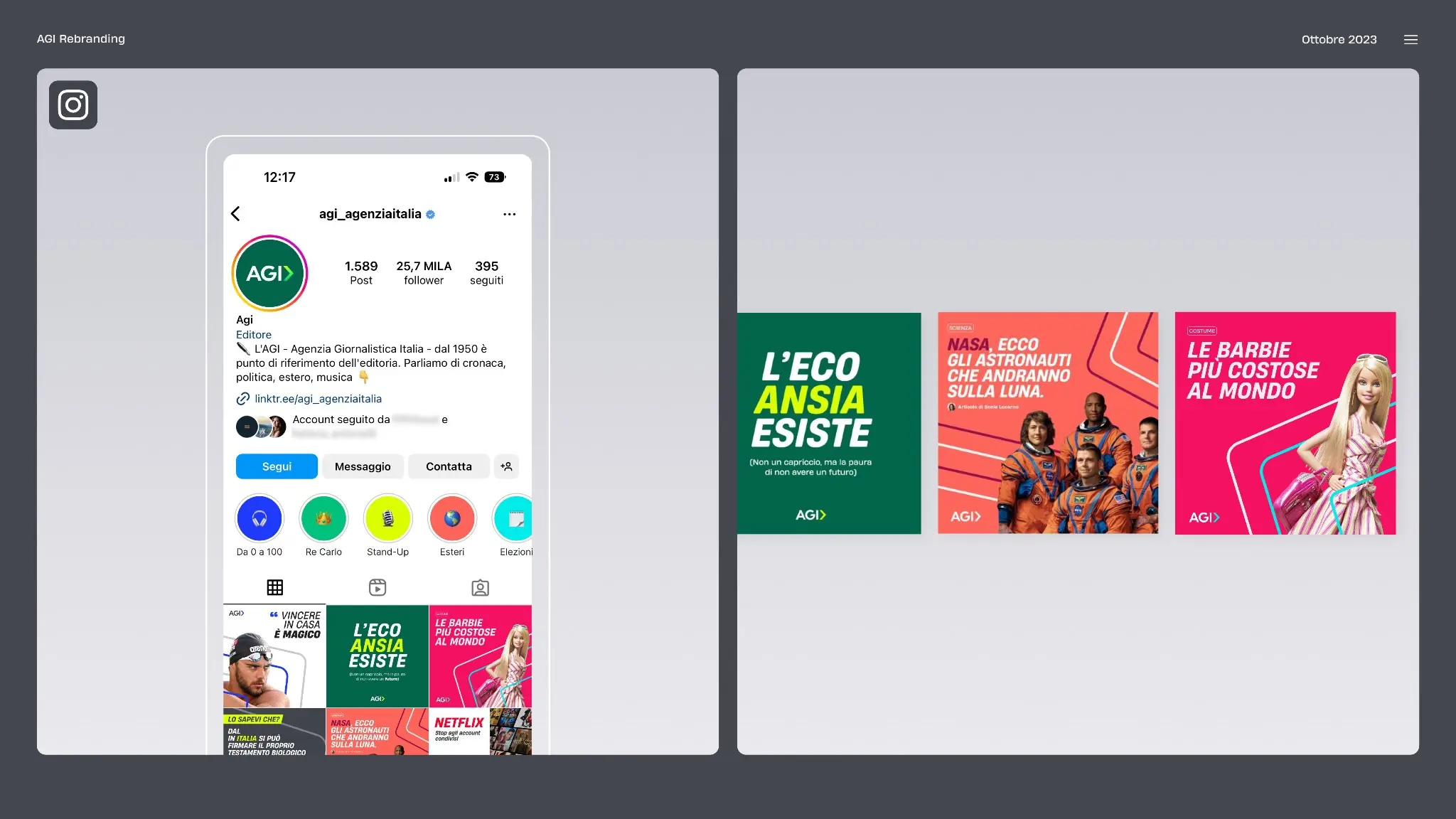
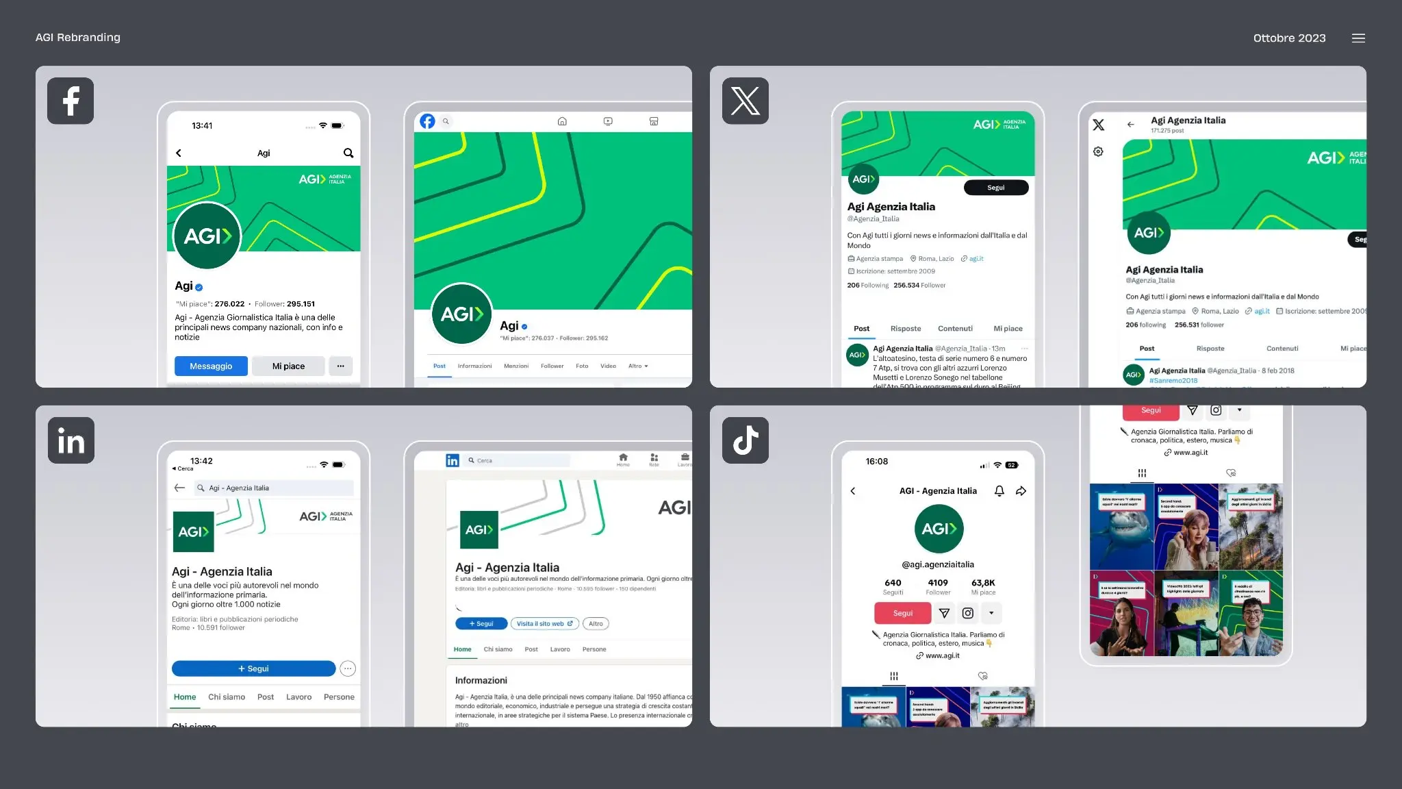
THE NEW EXPERIENCE IN ACTION
The rationale
The rebrand is grounded in a simple truth: the previous identity no longer expressed who AGI had become or where it was going. The visual language tended to emphasize legacy and institutional weight, but struggled to convey innovation, flexibility, and digital‑first thinking.
The new brand balances two dimensions—heritage and innovation. It honors AGIʼs history as a trusted news agency while making space for data services, platforms, and products that look and feel as advanced as the technology behind them. This duality is visible in the combination of structured typography, bold compositional grids, and restrained but distinctive use of color.
Future vision and continued innovation
The rebrand is not a finish line but a foundation. With a clearer brand architecture and a flexible visual system in place, AGI can continue to expand its portfolio of products and services without having to reinvent its identity each time.
As new technologies, formats, and platforms emerge, AGI can plug them into a coherent ecosystem that users and partners recognize and trust. The brand remains anchored in journalistic integrity, speed, and relevance, while staying open to continuous digital experimentation and evolution.
If you tell how you plan to use this (website case, creds deck, award submission), the next step can be: a shorter “hero” version, or a more product‑oriented variant that leans harder on Agi Prima and the digital ecosystem.